
how to choose the right kitchen backsplash
Introduction
AFFILIATE DISCLOSURE: This post contains affiliate links. If you purchase through these links, I may earn a small commission at no additional cost to you. I only recommend products I genuinely love or would use in my own designs. This post is not sponsored, and all opinions are my own.
RENDERING DISCLAIMER: The images in this post are digital renderings created to illustrate my original design concepts. They are intended for inspiration and visualization and may not represent exact dimensions, materials, or construction details. See my full Disclosure & Disclaimer Policy for more information.
Why Your Backsplash Matters
The backsplash matters because it sits at the intersection of several of the room’s most important finishes. In a kitchen, it visually connects the cabinetry and countertops, while in a bathroom, it can help connect the vanity, countertop, flooring, and plumbing finishes. Even though it may cover less surface area than other materials, it can have a surprisingly large impact on whether the room feels cohesive.
A backsplash also gives you an opportunity to control the visual balance of the space. It can quietly support more dramatic cabinets or countertops, or it can become a focal point through color, pattern, texture, shape, or an interesting installation.
Beyond aesthetics, the backsplash serves an important practical purpose. It creates a durable, cleanable surface in areas that are regularly exposed to water, grease, food splatter, and everyday messes.
Most importantly, the backsplash can be the element that makes all of your other selections feel connected and intentional. The right backsplash shouldn't simply look beautiful on its own—it should make the entire room look better.
Step 1: Start With Your Fixed Finishes
The backsplash is usually best selected after the other major kitchen or bathroom finishes because it acts as a connecting layer between elements like the cabinetry, countertops, flooring, and plumbing or metal finishes. Those larger, more permanent selections establish the room’s overall color palette, undertones, and level of visual movement.
For example, a countertop with dramatic veining may call for a quieter backsplash that lets the stone be the focal point. A simple countertop, on the other hand, gives you more freedom to introduce pattern, texture, color, or an interesting tile layout through the backsplash.
Choosing the backsplash later also makes it easier to:
Coordinate undertones: You can compare tile directly with the countertop, cabinetry, and flooring rather than trying to predict how everything will work together.
Balance visual movement: Busy stone often pairs better with simpler tile, while understated finishes can support a more decorative backsplash.
Fill a gap in the palette: Once the major finishes are chosen, you can see whether the room needs more warmth, contrast, texture, or color.
Avoid designing around a small element: Cabinetry, countertops, and flooring represent much larger visual and financial commitments. It's generally easier to find a backsplash that complements them than to find all your major finishes to coordinate with one specific tile.
Think of the backsplash as one of the finishing pieces that ties the room together. Select the major foundational finishes first, then use the backsplash to reinforce, balance, or add interest to the palette you've already established.
Step 3: Choose the Right Material
The backsplash matters because it sits at the intersection of several of the room’s most important finishes. In a kitchen, it visually connects the cabinetry and countertops, while in a bathroom, it can help connect the vanity, countertop, flooring, and plumbing finishes. Even though it may cover less surface area than other materials, it can have a surprisingly large impact on whether the room feels cohesive.
A backsplash also gives you an opportunity to control the visual balance of the space. It can quietly support more dramatic cabinets or countertops, or it can become a focal point through color, pattern, texture, shape, or an interesting installation.
Beyond aesthetics, the backsplash serves an important practical purpose. It creates a durable, cleanable surface in areas that are regularly exposed to water, grease, food splatter, and everyday messes.
Most importantly, the backsplash can be the element that makes all of your other selections feel connected and intentional. The right backsplash shouldn't simply look beautiful on its own—it should make the entire room look better.
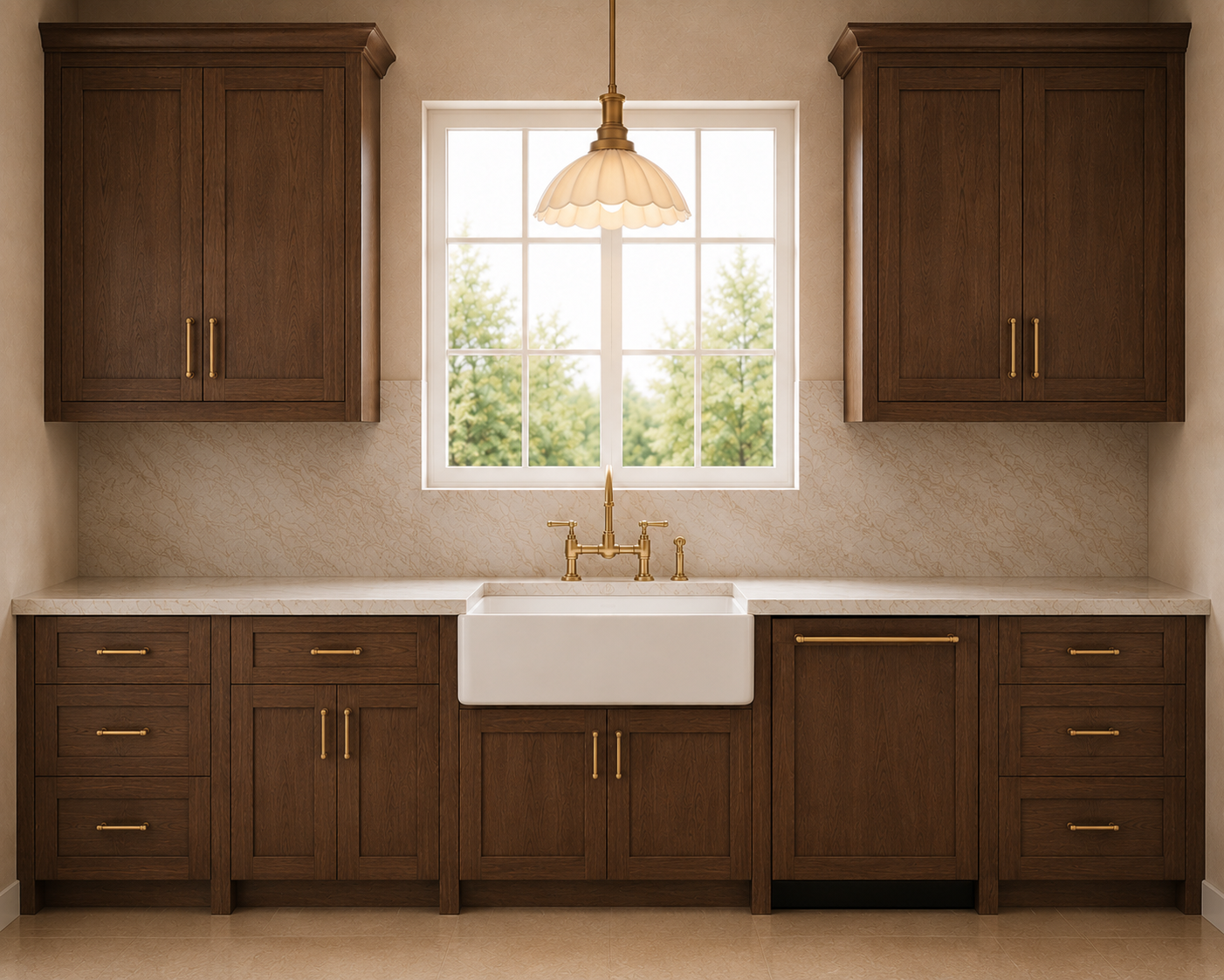
Slab backsplash
A digital rendering showing a slab backsplash
Step 4: Choose the Right Color
Warm vs. cool undertones matter because the backsplash sits directly beside several finishes that already have their own undertones—especially the countertop, cabinetry, flooring, and paint. If those undertones fight each other, the room can feel slightly “off” even when every individual material is beautiful.
Warm backsplash undertones usually lean creamy, beige, taupe, yellow, peach, rust, or warm gray. They tend to pair naturally with warm woods, cream cabinetry, brass or bronze finishes, and stones with beige, gold, or brown veining.
Cool backsplash undertones lean blue, blue-gray, crisp white, charcoal, or cooler green. They often work well with cooler white cabinetry, gray or black finishes, nickel or chrome, and countertops with gray, blue, or cool veining.
You don’t necessarily need every finish to have the exact same undertone. In fact, a little contrast can make a room more interesting. The important thing is that the undertones feel intentional rather than accidental. A very creamy backsplash beside an icy blue-white countertop, for example, can make one finish look yellow and the other look unusually cold.
The easiest way to judge this is to place the actual backsplash sample directly against your countertop, cabinet finish, and flooring in the room’s lighting. Look at them together rather than evaluating the tile by itself. The right backsplash should help the major finishes feel more connected, not introduce a new undertone that competes with them.
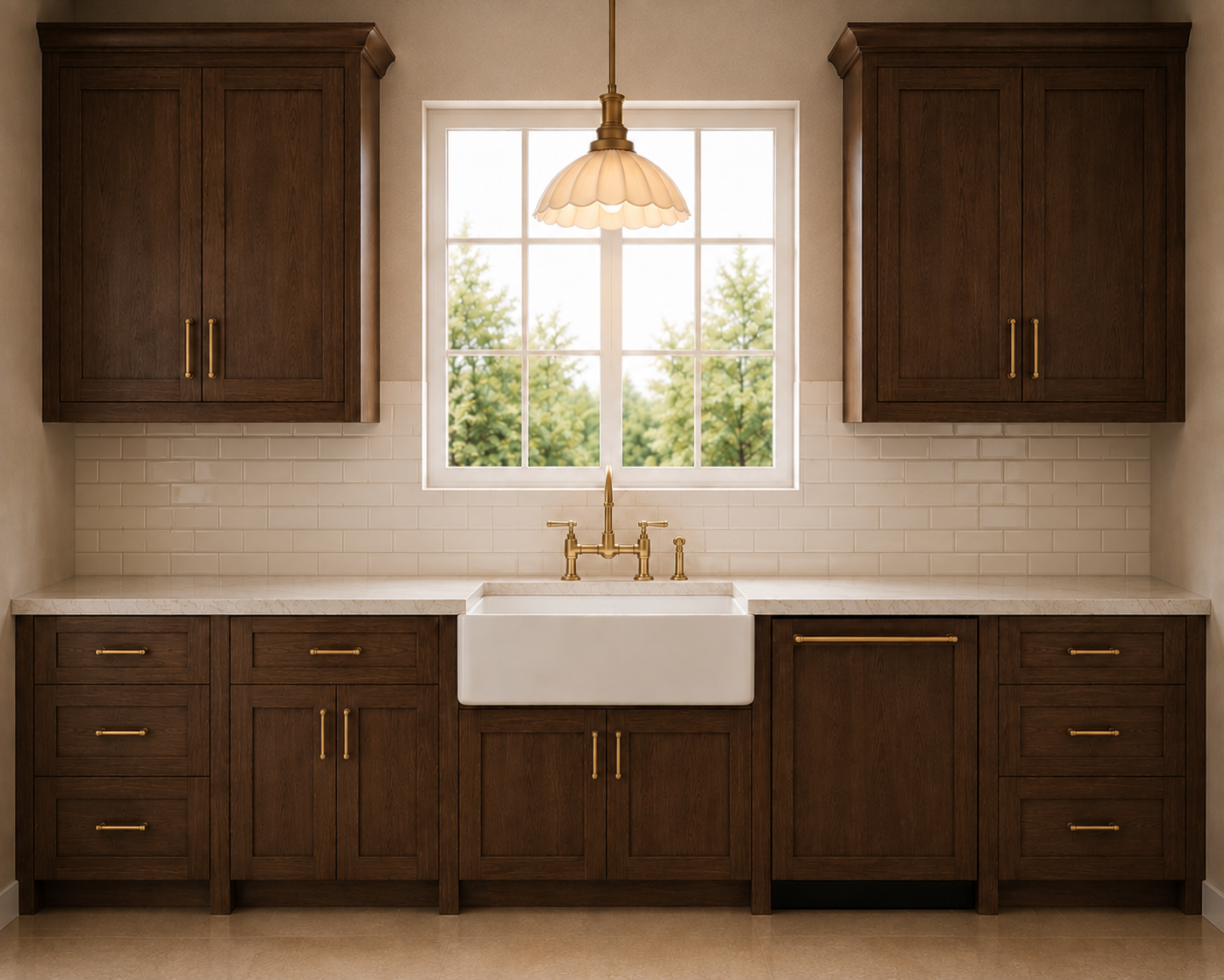
Light Tile Backsplash
A digital rendering showing a light subway tile
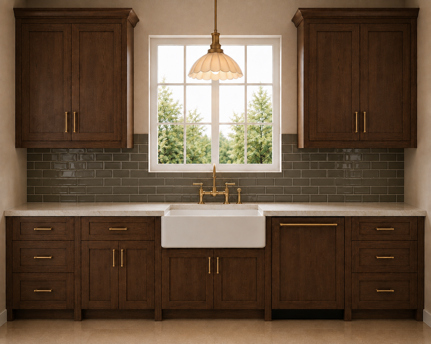
Dark Tile Backsplash
A digital rendering showing a darker subway tile
Step 5: Think About Pattern and Movement
Pattern and movement refer to how visually active a surface feels. In a backsplash, movement can come from veining, color variation, grout lines, tile shape, a decorative layout, or the natural irregularity of materials like zellige or stone. A simple subway tile in a quiet color has very little movement, while a heavily veined marble, patterned mosaic, or bold handmade tile creates much more.
The goal is usually to create balance between the backsplash and the countertop rather than having both compete for attention. If the countertop has strong veining, dramatic color variation, or a highly patterned stone, a quieter backsplash often works best. A simple ceramic or porcelain tile, subtle handmade tile, or another low-contrast material allows the countertop to remain the focal point and keeps the room from feeling overly busy.
Another beautiful option with a highly patterned countertop is to continue the same slab material up the wall as the backsplash. Because the veining continues rather than introducing a completely new pattern, the result can actually feel more cohesive and streamlined—even when the stone itself is dramatic. It creates one continuous visual statement instead of two competing ones.
On the other hand, when the countertop is relatively simple and restrained, the backsplash has more room to introduce pattern, texture, color, or an interesting installation.
A helpful rule is: decide where you want the visual movement to live. If the countertop is already doing a lot, let the backsplash support it. If the countertop is quiet, the backsplash can take on more of the design interest.
Step 6: Choose the Right Tile Size
Tile size plays a big role in how a backsplash feels because it affects scale, grout lines, pattern, and visual movement. The right size should relate to the proportions of the room, the size of the wall area, and how much visual interest you want the backsplash to create.
Smaller tiles—such as mosaics, small squares, or narrow rectangles—create more grout lines and therefore more visual texture. They can work beautifully in smaller areas, niches, or when you want the backsplash to feel more detailed and decorative. The tradeoff is that they can look busier and usually require more grout maintenance.
Medium-size tiles are often the easiest to use because they provide some pattern and rhythm without overwhelming the space. Classic subway sizes and similar formats are versatile and work well in both traditional and modern kitchens and bathrooms.
Larger-format tiles create fewer grout lines and a cleaner, more continuous appearance. They can make a backsplash feel calmer and more contemporary, and they are especially useful when the countertop already has a lot of movement. Large-format porcelain can even create a slab-like effect at a lower cost.
When choosing the size, think about the actual dimensions of the backsplash area. Ideally, the tile should fit the wall in a way that avoids lots of tiny slivers or awkward cuts at cabinets, corners, outlets, and edges. A larger tile may look beautiful in a showroom but feel awkward on a very short backsplash if most of each tile has to be cut down.
Also consider how tile size works with the rest of the room. If you already have busy countertops, detailed cabinetry, or patterned flooring, a larger or simpler tile can provide visual relief. If the surrounding finishes are quiet, a smaller or more interesting tile size can add texture and character.
The goal is to choose a scale that feels proportionate to the space and balanced with the other finishes, rather than choosing a tile size simply because it is currently popular.
Step 7: Pick a Layout
Tile layout can completely change the character of a backsplash, even when you’re using the exact same tile. The pattern determines how much movement, rhythm, and visual interest the backsplash adds to the room.
A straight or stacked layout creates a cleaner, more structured look. Horizontal stacking can make a backsplash feel wider, while vertical stacking can draw the eye upward and make the space feel taller. These layouts work especially well when you want the material or color of the tile to be the focus rather than the pattern.
A running bond or traditional brick pattern feels classic and familiar. Because the joints are offset, it adds a little more movement than a stacked layout without becoming visually busy, which makes it a versatile choice for many kitchen and bathroom styles.
Herringbone adds significantly more movement and tends to feel more decorative. It can work beautifully as a focal point behind a range or vanity, but across a large backsplash it can become much more visually dominant. Chevron creates a similar sense of movement but has a sharper, more continuous directional effect.
More intricate layouts—such as basketweave, diagonal, mosaic, or geometric patterns—can add a lot of personality, but they also create more grout lines and visual activity. They tend to work best when the surrounding finishes are relatively quiet.
When choosing the pattern, think about how much else is already happening in the room. If you have dramatic countertops, detailed cabinetry, patterned flooring, or several competing finishes, a simple layout can give the eye somewhere to rest. If the rest of the palette is understated, the backsplash pattern can become a great place to add interest.
Also consider the shape and dimensions of the actual backsplash area. The best layout should work cleanly around cabinets, corners, outlets, windows, and focal areas without creating awkward slivers or incomplete patterns.
A good rule is to treat the layout as part of the overall design hierarchy: the more dramatic the pattern, the quieter the surrounding finishes should usually be.
Step 8: Don’t Overlook Grout
Grout has a much bigger impact on a backsplash than people often expect because it affects both the overall look of the tile and how easy the surface is to maintain. The grout color, width, and type can make the tile pattern either blend in or stand out.
A grout color that closely matches the tile creates a quieter, more seamless look. This is especially helpful when the tile itself already has a lot of variation, pattern, or movement. Matching grout lets the material be the focus instead of emphasizing every individual tile.
A contrasting grout color makes the layout much more noticeable. Dark grout with light tile, for example, outlines every tile and emphasizes patterns like subway, herringbone, or geometric layouts. This can add a lot of graphic interest, but it also makes irregular spacing or imperfect installation more obvious.
Grout width matters too. Narrow grout joints usually feel cleaner and more contemporary, while wider joints create more visible pattern and texture. Handmade and irregular tiles, like zellige, may naturally require more variation in the grout lines than perfectly manufactured porcelain or ceramic tile.
Maintenance should also be considered. Grout can be more prone to staining and discoloration than the tile itself, particularly in kitchens. Very light grout behind a range or sink may require more upkeep. Choosing a quality grout, properly sealing it when required, and selecting a color that works with the way the space is actually used can make the backsplash much easier to live with.
The best grout choice should support the design intention: match the grout when you want the backsplash to feel calm and continuous, or create contrast when you want the tile pattern to become a stronger design feature.
Step 9: Balance Style With Maintenance
Maintenance is an important part of choosing a backsplash because some materials are much easier to live with than others. A backsplash sits in a high-use area, so it may be exposed to grease, food splatter, water, soap, cosmetics, and frequent cleaning.
Smooth, nonporous materials like glazed ceramic, porcelain, glass, and many slab surfaces are generally the easiest to maintain because spills can usually be wiped away without absorbing into the material. They also tend to resist staining better.
More porous materials, including many natural stones and some handmade tiles, may require sealing to help protect against staining and moisture. Depending on the material, that sealer may need to be reapplied periodically.
Grout is another maintenance consideration. Even when the tile itself is easy to clean, grout lines can collect dirt and discolor over time. Smaller tiles and intricate patterns create more grout lines, which usually means more upkeep than large-format tile or a slab backsplash.
Texture also matters. Highly textured, uneven, or handmade surfaces can be beautiful, but they may trap grease or residue more easily than a smooth tile. This is especially worth considering behind a cooktop or range.
Before choosing a backsplash, think realistically about how much maintenance you are comfortable with. If you want something very low maintenance, prioritize smooth, durable, nonporous materials with fewer grout lines. If you love a higher-maintenance material, just make sure you understand the sealing, cleaning, and care it will require so the backsplash continues to look good over time.
Common Kitchen Backsplash Mistakes
Include:
Choosing the backsplash first
Competing with bold countertops
Ignoring undertones
Following short-lived trends
Choosing tiny mosaics in large kitchens
Using too many different finishes
Forgetting grout color
Skipping full-size samples
Designer Tips for Choosing a Backsplash
Start with the countertop.
Let one finish be the star.
Consider the kitchen as a whole—not each finish separately.
Bring cabinet and countertop samples when shopping.
View tile in natural and artificial light.
Think about maintenance before aesthetics alone.
When in doubt, keep the backsplash quieter than the countertops.
Quick Reference Guide
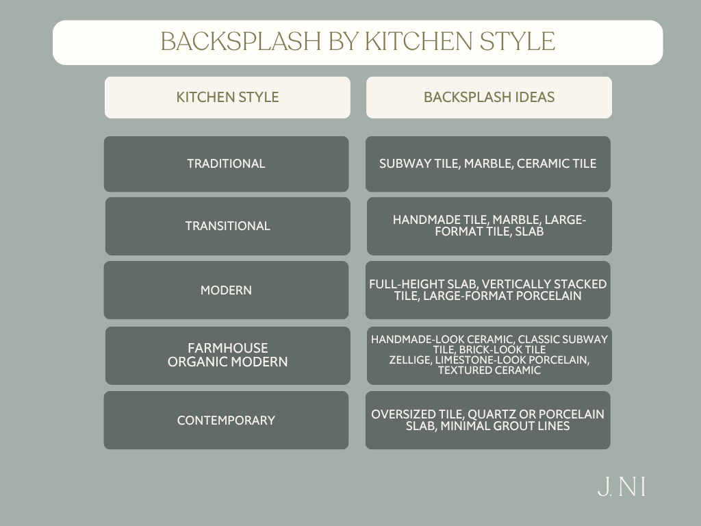
Conclusion
The best kitchen backsplash isn’t simply the prettiest tile in the showroom—it’s the one that complements your cabinets, countertops, flooring, and lifestyle. By considering material, color, pattern, layout, grout, and maintenance together, you’ll create a kitchen that feels cohesive, timeless, and uniquely yours.
