
how to choose the right white paint for your home
Why White Paint Is So Tricky
If you have ever struggled with white paint colors, you are not alone. Whites and shades of white are some of the hardest colors to choose.
This is because:
White reflects everything around it.
Undertones in white or off white colors become much more obvious as compared to more saturated colors.
Lighting
And many more.
AFFILIATE DISCLOSURE: This post contains affiliate links. If you purchase through these links, I may earn a small commission at no additional cost to you. I only recommend products I genuinely love or would use in my own designs. This post is not sponsored, and all opinions are my own.
RENDERING DISCLAIMER: The images in this post are digital renderings created to illustrate my original design concepts. They are intended for inspiration and visualization and may not represent exact dimensions, materials, or construction details. See my full Disclosure & Disclaimer Policy for more information.
Step 1: Start With Your Fixed Finishes
It is important to evaluate your current materials before selecting a neutral base color (in this case, white). Think about the following items in your home:
Flooring
Countertops
Backsplash
Cabinets
Brick
Stone
Fireplace
Tile
Your paint should complement these items and help tie them together.
Step 2: Understand Undertones
Once you understand undertones, choosing a color becomes much less daunting. Think of it like each color has 2 colors:
The mass color - the main color you see (ie: white)
The undertone - the subtle color underneath
Imagine you have 3 glasses of milk and you add one drop of food coloring (differing colors) to each glass. They all still look pretty white, but each one leans a little more towards whatever color was added.
Undertones may include:
Yellow
Orange
Green
Red
Blue
Purple
Etc.
A good way to determine what the undertone in your paint color is, is to compare it to a true neutral white. You can do this simply by holding your paint sample up to copy paper.
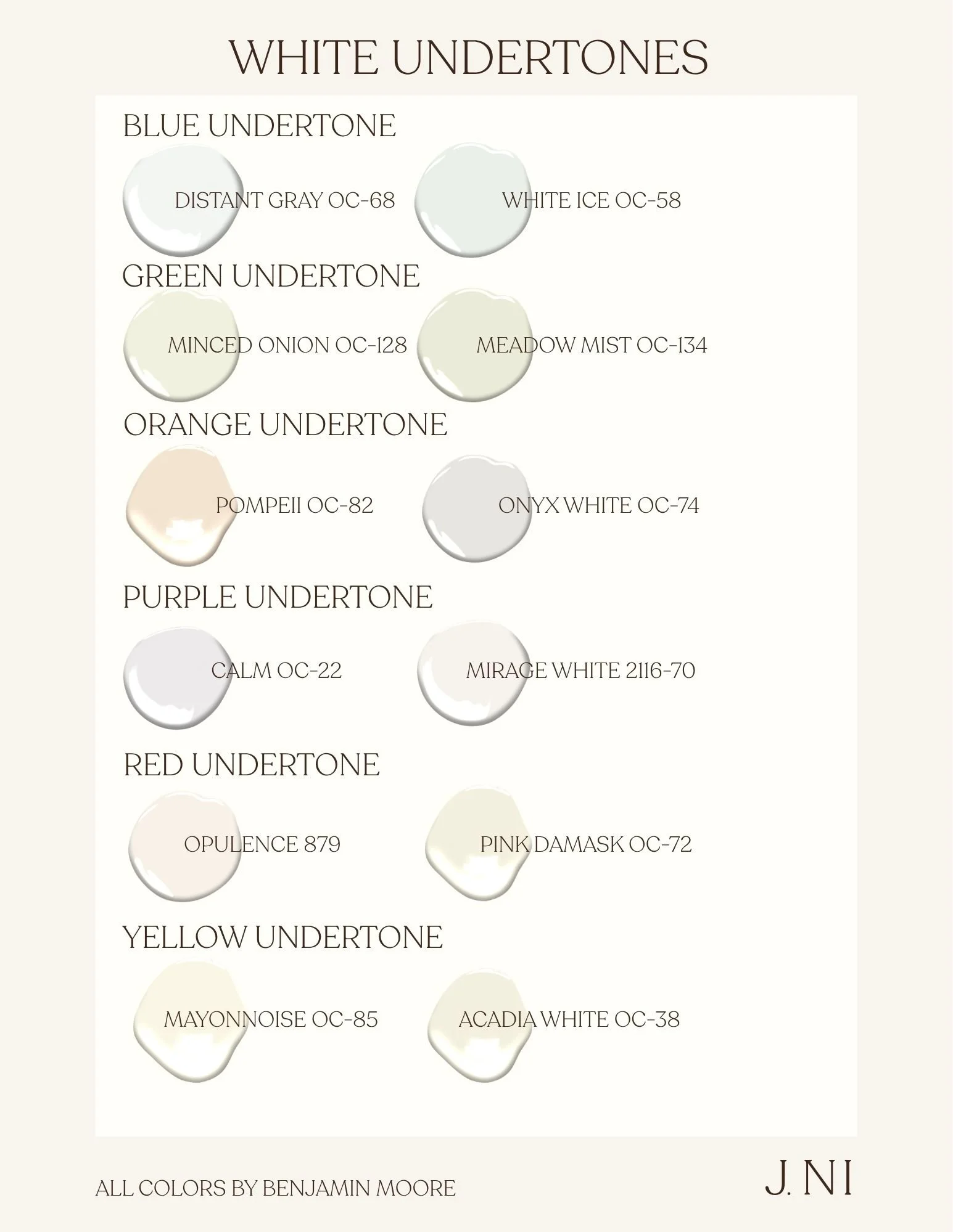
Compare White Paints Together
Instead of testing one white, compare several at once.
Recommend:
3–5 similar options
Large sample boards
Viewing throughout the day
Step 3: Consider Natural Light
The way the sun hits your room will change the way the color appear. This is why at hardware stores they usually provide the option to view your paint samples under different lights.
North-facing rooms
Cooler light
Typically darker and more muted
Whites appear grayer or bluer
South-facing rooms
Warm sunlight
Whites appear creamier
Cool whites might appear more balanced
East-facing rooms
Warm mornings, cooler afternoons
West-facing rooms
Cooler mornings, warmer evenings
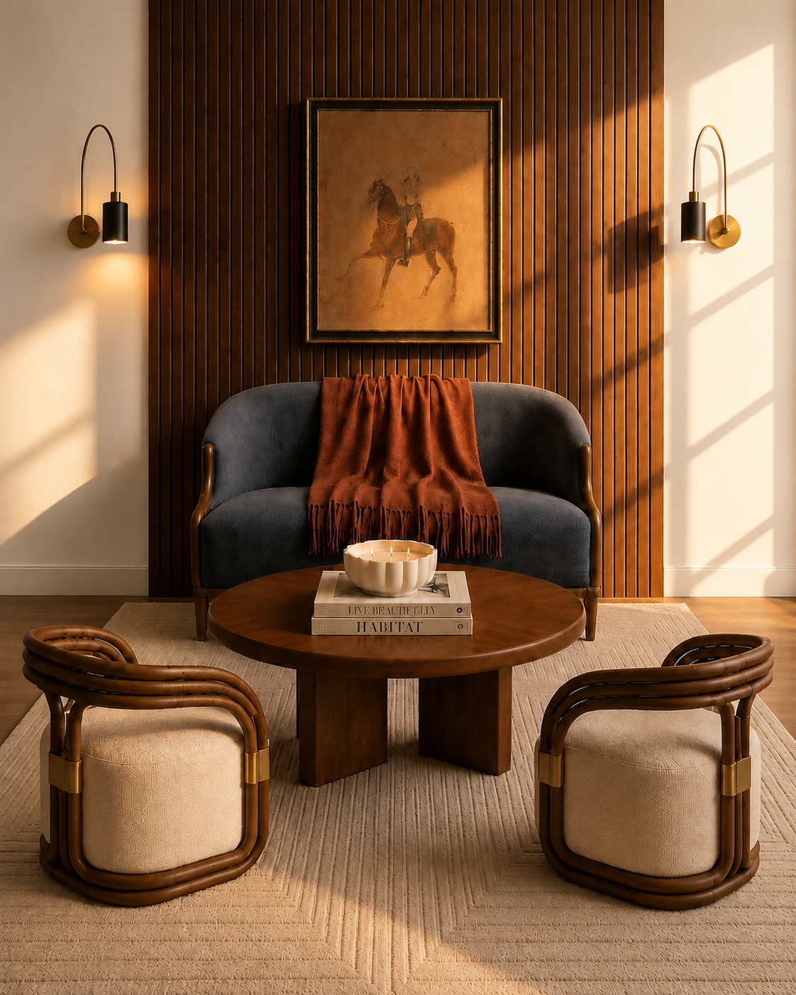
East Facing Morning Sun
A digital rendering showing what east facing sun in the morning might look like on a white wall. This particular wall is representing BM Chantilly Lace.
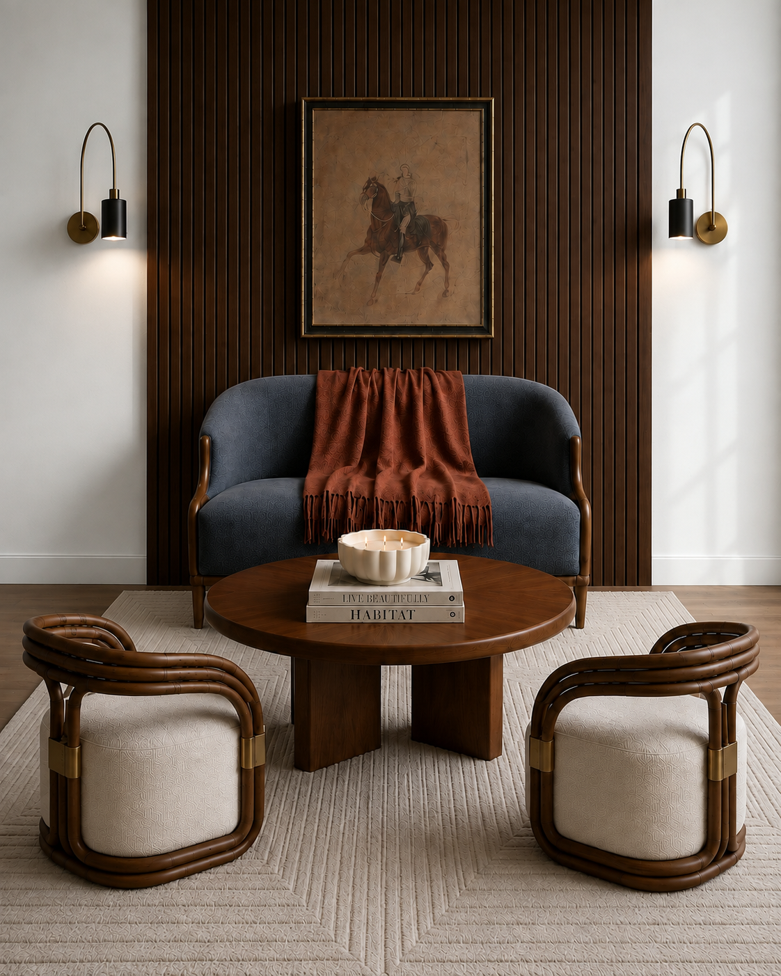
North Facing Sun
A digital rendering showing what north facing sun in the morning might look like on a white wall. This particular wall is representing BM Chantilly Lace.
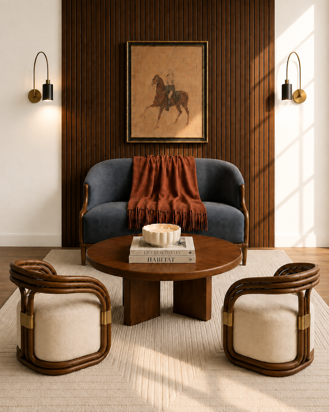
South Facing Sun
A digital rendering showing what south facing sun in the morning might look like on a white wall. This particular wall is representing BM Chantilly Lace.
Step 4: Think About the Mood You Want
Think about the style of room you want and that should give you an idea of what type of white you should go with:
Warm white:
Cozy
Traditional
Organic
European-inspired
One of my favorite ways to use a warm white is in transitional designs with a european flair. I also love to use a warm white with limewash plaster.
Cool white:
Crisp
Modern
Contemporary
Neutral white:
Flexible
Timeless
Step 7: Test & Coordinate:
Best practices:
Paint large sample boards or peel-and-stick samples
Move them around the room
View morning, afternoon, evening, and artificial light
After you have narrowed down your paint samples, then you can try painting larger samples on the wall itself.
Trim, Ceiling, and Walls
There are several ways to approach ceilings, trim, and white walls, but here are some common ways:
Same white everywhere
Walls lighter than trim
Trim brighter than walls
Ceiling matched vs. lighter
Common White Paint Mistakes
Include:
Choosing paint under store lighting
Ignoring undertones
Matching someone else’s home exactly
Forgetting flooring influences paint
Skipping samples
Choosing the brightest white automatically
Testing only one option
Forgetting nighttime lighting
Designer Tips for Choosing White Paint
Suggestions:
Start with your finishes, not the paint deck.
Compare whites side by side.
Sample before buying gallons.
Walk through the room at different times of day.
Remember that sheen affects perception.
White should support the architecture—not become the focal point.
Conclusion
There is no “perfect white”. There is only the right white for your home. When you understand undertones , lighting and existing finishes, you can confidently choose a color that will feel cohesive and timeless throughout your entire home.
