
The Rule of Three in Interior Design
introduction
AFFILIATE DISCLOSURE: This post contains affiliate links. If you purchase through these links, I may earn a small commission at no additional cost to you. I only recommend products I genuinely love or would use in my own designs. This post is not sponsored, and all opinions are my own.
RENDERING DISCLAIMER: The images in this post are digital renderings created to illustrate my original design concepts. They are intended for inspiration and visualization and may not represent exact dimensions, materials, or construction details. See my full Disclosure & Disclaimer Policy for more information.
What Is the Rule of Three?
Use the Rule of Three
When arranging decor, odd-numbered groupings tend to feel more visually appealing than even-numbered ones. Our eyes naturally move around an arrangement of three rather than immediately dividing it into matching pairs, which helps the display feel more relaxed and intentional.
Three is especially useful because it creates movement, balance, and visual interest without becoming overwhelming. For example, a lamp, a small stack of books, and a decorative object on a console can feel complete without looking overly styled.
This also helps prevent a space from feeling too symmetrical or too random. Perfectly matched pairs can sometimes feel stiff or formal, while too many unrelated objects can look cluttered. A grouping of three often lands in the middle—it feels balanced, but still natural.
You can make the arrangement even more interesting by varying the height, shape, and scale of the three pieces. Instead of choosing three objects that are nearly identical, pair something tall, something medium, and something smaller so your eye naturally moves through the grouping.
And remember, the rule of three is a guideline rather than a requirement. The goal isn't to force every surface into groups of three, but to use odd-numbered groupings when you want decor to feel collected, balanced, and effortless.
Why the Rule of Three Works
The Rule of Three works because odd-numbered groupings tend to feel more natural and visually interesting than perfectly symmetrical arrangements. Our brains can quickly process pairs, which often makes them feel predictable. A group of three creates just enough variation to keep the eye engaged without making an arrangement feel cluttered or complicated.
It Creates Visual Balance
Three objects can create balance without relying on perfect symmetry. Instead of two matching items competing equally for attention, a third element creates a natural focal point and allows the composition to feel balanced while still having movement and variety.
It Encourages the Eye to Move
When objects are arranged in a group of three—especially when they vary in height, shape, scale, or texture—your eye naturally moves from one item to the next. This creates a small visual journey rather than allowing the entire arrangement to be understood at a single glance.
It Feels More Natural
Perfectly even arrangements can sometimes feel formal or rigid. Odd-numbered groupings introduce a little asymmetry, which tends to feel more relaxed and organic. This is one reason groups of three work especially well when you want a room to feel collected rather than overly coordinated.
It Makes Styling Feel Intentional
A single decorative object can sometimes look lonely, while a large collection can quickly become cluttered. Three often provides the sweet spot: enough pieces to create a composition, but not so many that they compete for attention.
The key isn’t simply placing three random objects together. The strongest groupings have a relationship—through color, material, style, or purpose—while still including enough variation to make the arrangement interesting.
Think of the Rule of Three as a starting point for creating visual rhythm and balance, not a rule that every surface in your home has to follow.
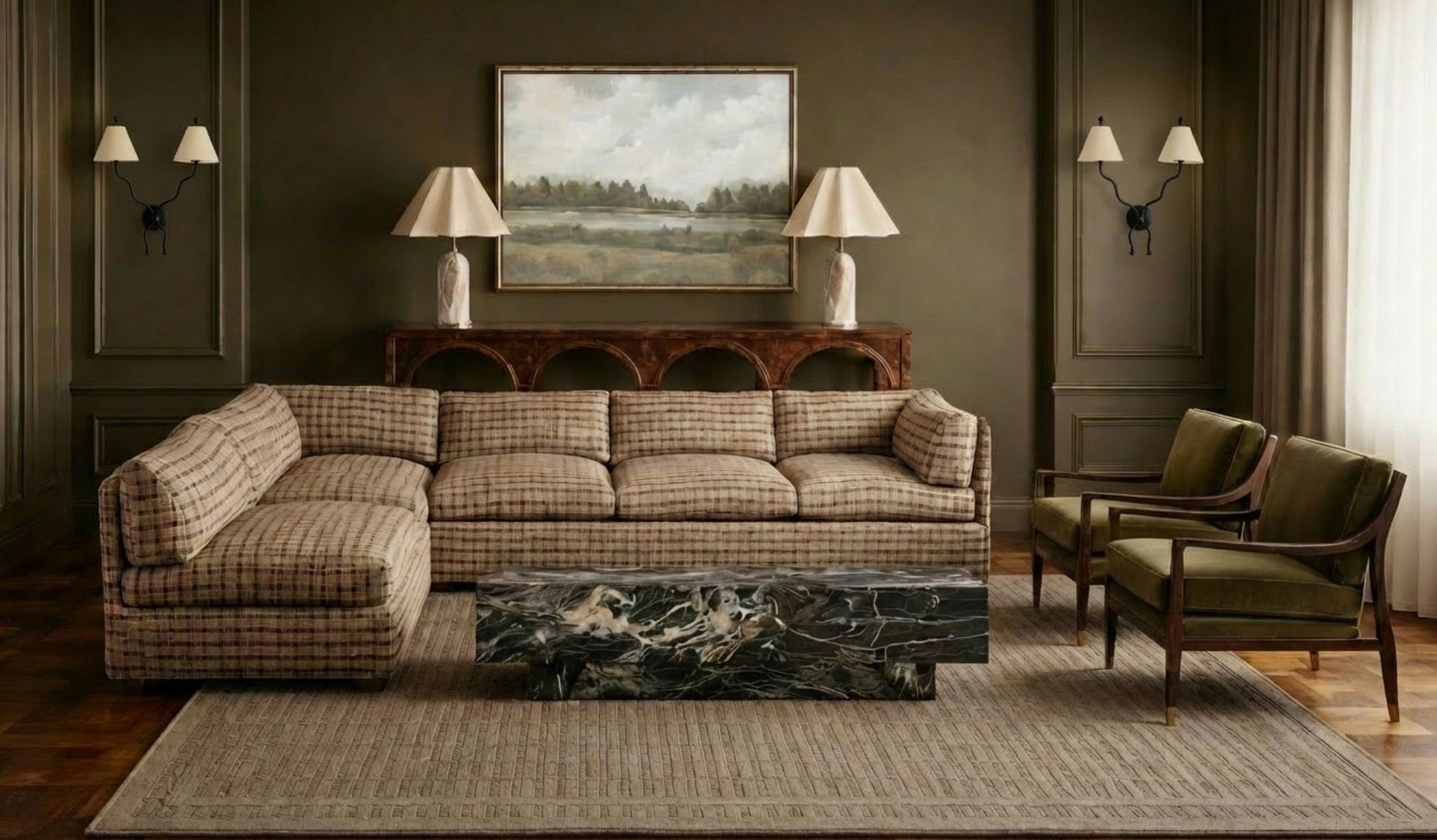
Considering the Rule of Three
A digital rendering that shows a symmetrical layout with repeating illustrations of the rule of 3.
In the image above, notice the console table. The lamps are a pair, but the painting makes 3 items. The seating in this living space is also arranged so that there are 3 pieces of furniture around a central location. These elements of 3 help break up the symmetry repeated through the design.
Step 1: Start With Decorative Accessories
Start with three decorative accessories that have a clear relationship but aren’t too similar—for example, a vase, candle, and book, or a bowl, plant, and sculpture. The goal isn’t simply to place three objects together; the arrangement works best when each piece brings something different to the composition.
Varying height, shape, and texture helps your eye move naturally from one object to the next. A tall vase paired with a low stack of books and a smaller rounded candle creates more visual interest than three objects that are all the same height and shape. Mixing materials—like ceramic, glass, wood, metal, or greenery—adds another layer of contrast without making the grouping feel busy.
Think of the three pieces as a small composition: one taller element, one medium element, and one lower or smaller element. That variation is what makes the Rule of Three feel intentional rather than simply looking like three random objects sitting next to each other.
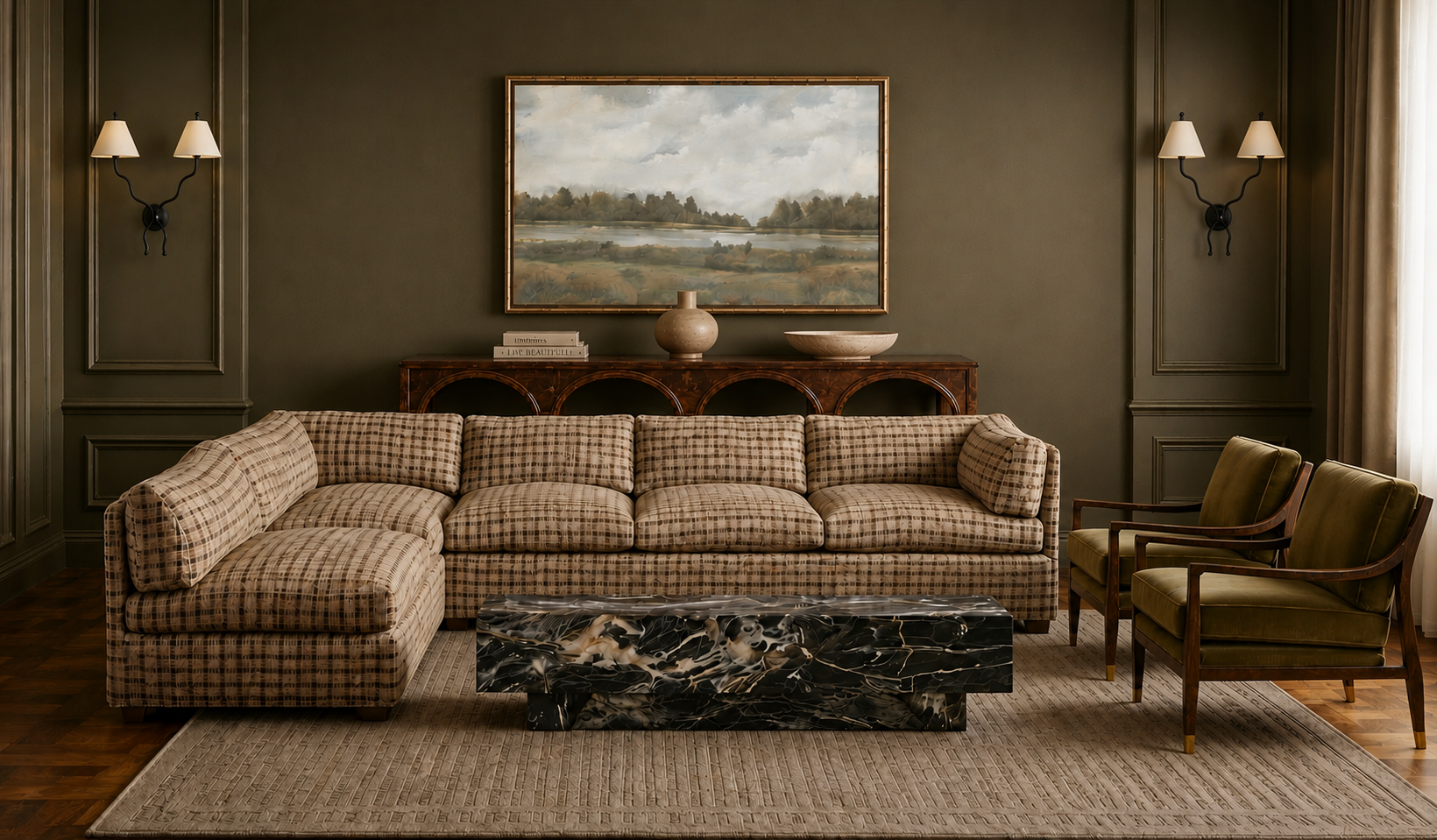
Rule of 3 : An example of 4
This is a digital rendering showing the same living room design as before, only this time we have changed out the decor to be various coffee table items , and we have added an extra item (as compared to the two lamps). There is no right or wrong answer, but more people may be drawn to the previous image because of the symmetry and the painting together. This allowed for the painting to break up the lamps and create a group of 3. In this image, we are using all different items, not varying too much in height, and there are 4 in total.
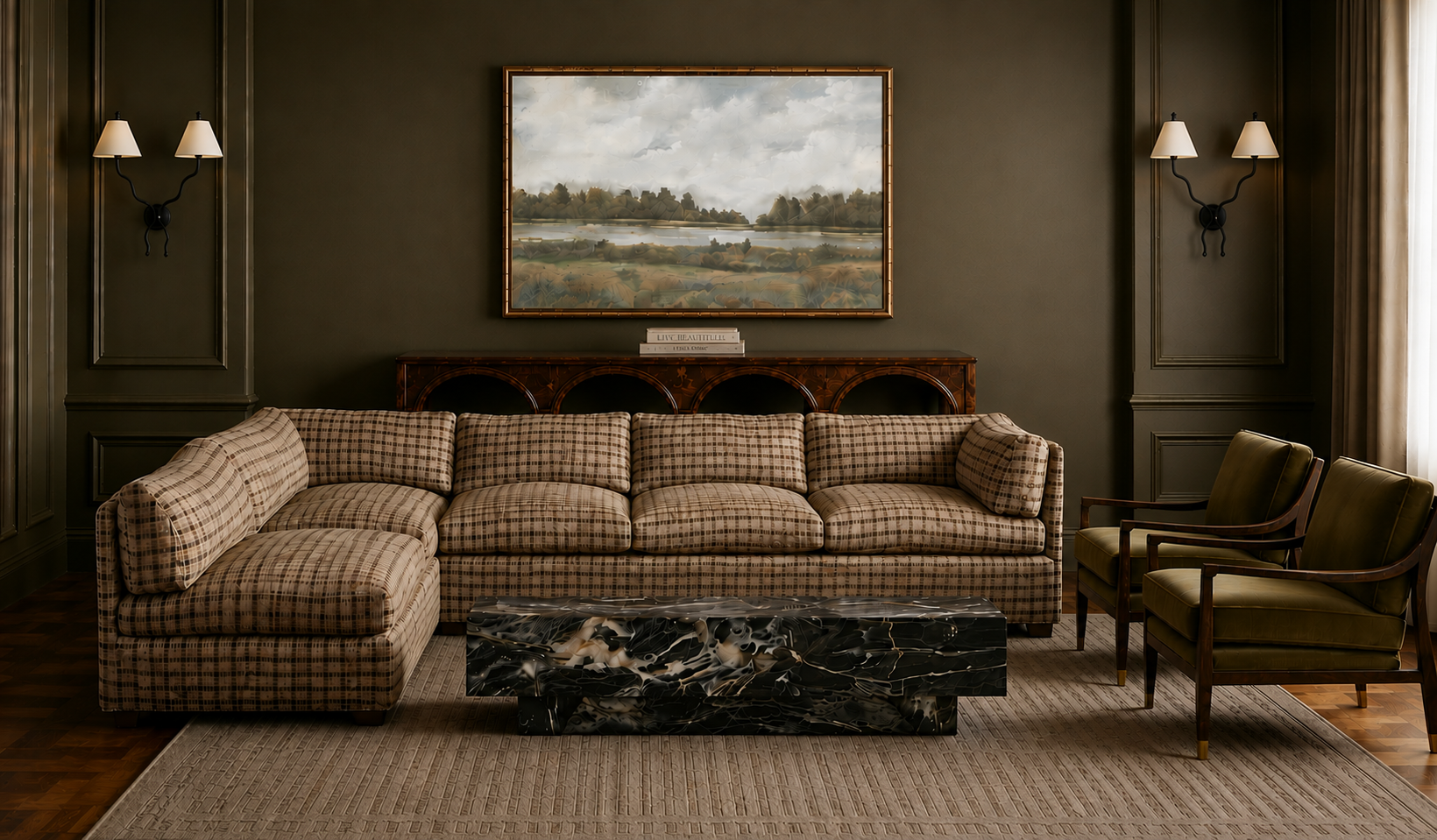
Rule of 3: An example of 2
This digital rendering shows the opposite of the above example. Instead of adding an extra item, we took away items. This is instead showing the painting paired with one additional item, resulting in 2 total. This image tends to leave the eye wanting more.
Step 2: Apply It to Coffee Tables
On a coffee table, the Rule of Three can work especially well when you think in small groupings instead of individual objects scattered across the surface. For example, one grouping might include a tray, candle, and greenery, while another could use a stack of books, a decorative object, and a small bowl.
The key is to give each grouping a little breathing room. Instead of filling every open spot, leave some of the tabletop visible so the arrangement feels styled rather than crowded. You can also let one grouping be more visually dominant and keep the second smaller and simpler.
Vary the scale between groups, too. A taller plant or vase can anchor one side of the table, while a low stack of books and a small object balance the other. This creates rhythm across the surface without making the coffee table feel like it’s covered in accessories.
A good rule of thumb is to style in clusters, not rows. The empty space between those clusters is just as important as the objects themselves.
Step 3: Style Shelves Using Groups of Three
When styling built-in shelves, use the Rule of Three to create small, intentional groupings rather than filling every shelf from end to end. A stack of books, a plant, and a decorative object can create one grouping, while another shelf might pair artwork, a basket, and a sculptural accessory.
The most important part is what you leave out. Negative space between groupings gives the eye a place to rest and helps each arrangement stand out. If every shelf is packed with books, baskets, plants, and decor, the individual pieces start to compete with one another and the shelving can quickly feel cluttered.
You also don’t need to use the exact same formula on every shelf. Alternate between vertical books and horizontal stacks, vary the size of artwork, and mix in larger pieces like baskets to create rhythm. Some shelves may only need one or two larger objects, while others can hold a full grouping of three.
For the before-and-after rendering, show the “before” shelves with accessories scattered evenly across every shelf, then restyle the “after” version using distinct groups of three with more open space around each arrangement. That contrast will make the Rule of Three—and the importance of negative space—immediately visible.
Step 4: Use It on Consoles and Dressers
Consoles and dressers are perfect places to use the Rule of Three because their long, flat surfaces can easily feel either too empty or too cluttered. Try a grouping such as a lamp, artwork, and decorative bowl, or combine a tall vase, stack of books, and candle for a more casual layered look.
The strongest arrangements usually include three different visual heights. Start with one tall element to anchor the grouping, add a medium-height piece to create transition, and finish with something lower to keep the eye moving across the surface. If every object is the same height, the arrangement can feel flat; varying the levels creates more rhythm and dimension.
You can also use wall art or a mirror as part of the composition. A piece of artwork behind a dresser, for example, can act as the tallest element while a lamp and low bowl complete the grouping. The goal is to create a balanced triangle-like composition rather than lining objects up evenly across the surface.
Step 5: Layer Different Heights
When styling a group of three, aim for three different visual heights: tall, medium, and short. For example, a tall vase can anchor the arrangement, a stack of books or medium-sized object can bridge the height difference, and a low candle or bowl can finish the grouping.
This height variation creates a natural up-and-down rhythm that keeps the eye moving through the arrangement. When all three objects are roughly the same height, your eye reads them as one flat horizontal line, which can make the styling feel stiff or unfinished.
Think of the grouping almost like a small triangle: one piece establishes the height, one fills the middle, and one brings the composition back down. The objects don’t need to follow an exact formula, but creating noticeable variation in height will almost always make the arrangement feel more dynamic and intentionally styled.
Step 6: Mix Shapes and Textures
Mixing different shapes and materials is another way to make a group of three feel layered instead of repetitive. Try combining something round, something square or structured, and something with a more organic shape—like a round bowl, a stack of rectangular books, and an irregular sculptural object.
The same idea applies to materials. Pair smooth glass with warm wood, matte ceramic with reflective metal, or soft fabric with substantial stone. You don’t need to use every material in one arrangement; the goal is simply to avoid choosing three pieces that all have the same finish and visual weight.
That contrast creates depth because each object catches light, creates shadow, and adds texture differently. A glass vase feels light and transparent, wood adds warmth, ceramic brings softness, and metal or stone can add a stronger visual anchor. When those differences are layered together, even a simple three-piece arrangement can feel much more dimensional and thoughtfully designed.
Step 7: Use the Rule Beyond Accessories
The Rule of Three goes far beyond styling a few accessories on a table. It can be used throughout an entire room to create rhythm, repetition, and visual balance.
Try it with three throw pillows on a sofa or bed, three pieces of artwork grouped on a wall, or three pendant lights over a kitchen island. You can also apply the idea more subtly through your finishes—such as working with three paint colors, three coordinating wood tones, or three repeated accent colors that appear in different places throughout the room.
The reason it works is the same: three creates enough repetition to feel intentional without becoming overly predictable. A color that appears once can feel random, but when it shows up in three different places—perhaps in a pillow, piece of artwork, and accessory—it starts to feel like part of the overall design.
That’s why the Rule of Three is best thought of as a design principle, not just a styling trick. It can guide everything from small decorative groupings to lighting, color palettes, finishes, and architectural composition, helping the entire room feel more cohesive and thoughtfully designed.
Step 8: Know When to Break the Rule
The Rule of Three is a guideline for creating balanced compositions, not a rule that everything in your home has to come in sets of three. Some arrangements naturally work better with pairs, larger groups, or repeated elements.
For example, dining chairs need to match the size of the table, not an arbitrary number. Twin nightstands usually make sense as a pair because they visually balance the bed. A large gallery wall may need five, seven, or even more pieces, while a collection of ceramics or books can include dozens of items.
The principle still helps, though. Even when you’re working with more than three objects, you can use it to guide how those pieces are grouped. A bookshelf filled with books, for instance, can be broken into smaller visual clusters with artwork, objects, or negative space between them. A gallery wall can contain many pieces while still having three dominant shapes, colors, or focal areas that organize the composition.
Think of the Rule of Three as a way to create rhythm, variety, and balance. Use it when it makes a space feel better—but don’t force it where symmetry, function, or a larger collection makes more sense.
Common Mistakes
Include:
Three objects that are all the same height
Matching everything exactly
Forgetting negative space
Using tiny accessories that feel insignificant
Choosing objects with no relationship to each other
Creating clutter instead of intentional groupings
Designer Tips
Think in layers, not just numbers.
Vary height, shape, and texture.
Let one object be the focal point.
Use trays to unify small objects.
Leave breathing room around each grouping.
Edit rather than continually adding more.
Quick Styling Formula
Offer a simple cheat sheet:
Coffee Table
Tray
Candle
Plant
Console
Lamp
Books
Decorative object
Nightstand
Lamp
Book
Small plant
Shelf
Books
Vase
Framed photo
Kitchen Island
Bowl
Greenery
Candle
Conclusion
The Rule of Three isn’t a rigid decorating rule—it’s a simple guideline that helps create balance and visual interest. By grouping items thoughtfully, varying height and texture, and leaving room for negative space, you can make almost any surface feel professionally styled.
